Booking.com · 2024–2025
Booking.com users selecting a room on Android and iOS faced a long list of near-identical cards. Differences between options were rarely obvious: some lost time scanning, some struggled to compare, some booked the wrong room. Most ended up defaulting to the cheapest choice.
After a track-wide H1 Sprint converging on HC as the strategic direction, I took ownership of adapting and shipping it on Android and iOS across three phases: Foundation work, MVP experiment, and future iterations.
Users selecting a room option faced two distinct problems:
The findability problem: Properties offered too many room-rate combinations, each presented as a separate vertical card. With some properties offering over 16 options, most users never explored beyond the first few.
The comparability problem: Many rooms shared the same amenities and size, giving users no reliable way to understand what differentiated one rate from another. When users could not find meaningful differences between the cheapest option and higher-value rooms, they settled for the first one they saw. The property shown below, for example, offers the same Family Room 8 different times, with minimal differences between options. Roughly 65% of users defaulted to booking the cheapest option. In post-checkout research, around 30% of users said they believed they had booked a free cancellation rate when they had not.
Choice overload in Room Selection had been a known problem for years, with multiple attempts to address it that never proved successful.
During H1, Room Selection designers were asked to come up with alternative designs: Filters Android, Filters iOS, Rate Selection, Horizontal Comparison and Multiple Choice.
I worked on both Filters concepts and continued into Two-Step Selection. Two other designers worked on the remaining concepts. Horizontal Comparison, tested in Mobile Web, emerged as the most promising approach.
During H2 I was asked to make a plan to implement the chosen solution in both Android and iOS.
Involved in the design
Not involved in the design
Horizontal Comparison fundamentally reorganised the Room Selection IA. Where the base experience showed room information and rates together in a single card, HC separates them: room information at the card level, rates inside a horizontal carousel.
After the first positive results of HC in Mobile Web, I had the space to take a more structured approach to the Apps implementation. Rather than running a single A/B experiment with multiple changes at once, I defined a three-phase roadmap:
This structure reduced risk by avoiding simultaneous variable changes and gave the team a framework for deferring complexity rather than letting it block progress.
It also meant that even if the core HC hypothesis hadn't worked, the foundational experiments would have still delivered measurable improvements to Base.
1.1 Component Audit
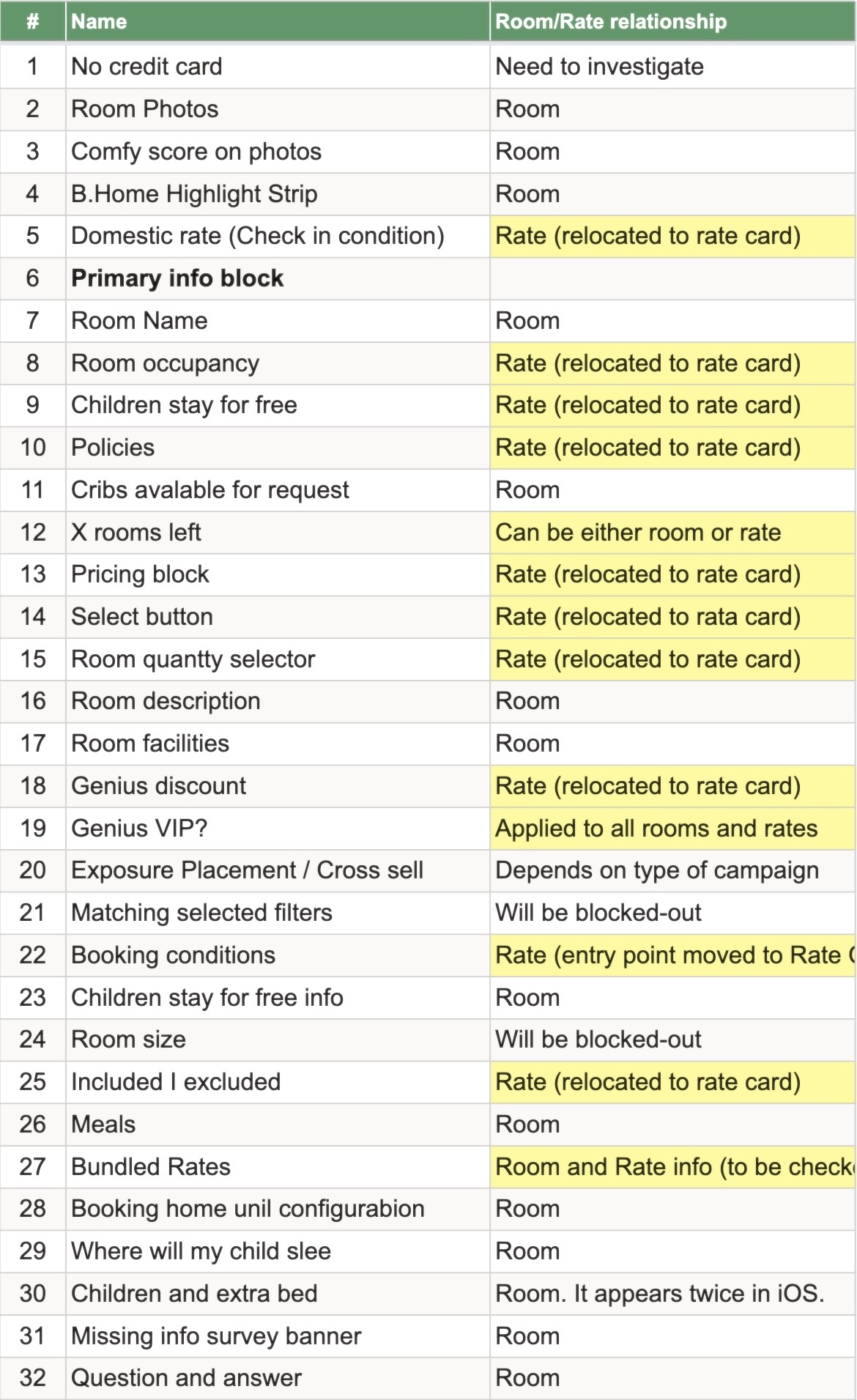
That room/rate split raised a critical question for every existing component: was it room-level (e.g. "Free cot available") or rate-level (e.g. "Free cancellation")? That answer determined where each component would live and whether it needed to be redesigned. To find out, my first step was to conduct a comprehensive audit of ~100 components across Room List and Room Details.
A sizeable portion of the components belonged to 6 other teams we regularly collaborated with. Each had their own roadmap and objectives, so I made it a priority to communicate with them on a regular basis — flagging upcoming changes before decisions were locked and adapting our designs to fit their business needs.
1.2 Block-out Experiments
The audit also revealed an opportunity to clean up Room Selection from components added years earlier.
Each A/B experiment that ships leaves components in the codebase. The more that accumulate, the larger the maintenance burden for both UX and engineering. As the person responsible for the audit, I identified candidates for blockout experiments to test whether those components were still relevant.
The ones that weren't could be removed, saving the team from having to redesign or maintain them as part of the HC rollout. This resulted in removing 12+ components with no meaningful impact on conversion, including: Secret deal banner, Lowest price badge, Just booked, and Booked before, among others.
1.3 Information Architecture improvements
One of the main objectives of the Foundational Work was to test the Horizontal Comparison hypothesis in the most isolated way possible, by avoiding pushing multiple changes into the same A/B experiment. The fewer changes, the easier to interpret the results.
In this case, it meant grouping the elements of the room card by room and rate within the current design. A clearer information hierarchy proved its value on its own: +629±763 PNC on Android and +375±244 PNC on iOS.
The positive results helped convince Product that a larger Information Architecture initiative could benefit the business, and were shared in monthly Product presentations as examples of what the track could deliver.
‘Where will my child sleep?’ was a component owned by Families team, present only in Apps, meaning that we didn’t have to consider how it fit in Horizontal Comparison redesign until I ran our Component Audit. To understand the issue I ran into, we first have to consider the Content structure of Room Details, the screen where it lived.
The Room Details screen served as the detailed view for each room/rate combination. Content fell into 4 categories:
| Tier | Example | |
|---|---|---|
| Room |
Overview |
Free WiFi |
|
Details block |
Superb WiFi, rated 9.3 - based on 7 ratings. WiFi is available in all areas and is free of charge. | |
| Rate |
Overview |
Non-refundable |
|
Details block |
Non-refundable: if cancelled, modified or in case of no-show, the total price of the reservation will be charged. |
Each product team had historically placed their Details blocks wherever they saw fit. Despite several IA audit initiatives being proposed over the years, none had translated into action. The audit surfaced three competing approaches in production:
The structural split between room and rate created a new content placement problem. Room and rate overviews had a clear home. The problem was rate-level detail blocks:
| Content type | Location |
|---|---|
| Room overview | Room Card |
| 'Room Details' blocks | Room Details screen |
| Rate Overview | Rate Card |
| 'Rate Details' blocks | No defined location |
"Where will my child sleep?" was one of those Rate Details blocks, owned by the Families team, previously located in the Room Details screen, now looking for a new home. Backed by extensive research and experimentation, removing the component was not an option.
Standard city view
Price for 2 nights, 2 adults, 1 child
Includes taxes and fees
Booking conditions
Where will my child sleep?
Meals
Room size: 247 ft2
Room description
Featuring free toiletries, this double room includes a private bathroom with a walk-in shower, a hairdryer and slippers. The air-conditioned double room features a flat-screen TV.
Standard city view
Where will my child sleep?
Room description
Featuring free toiletries, this double room includes a private bathroom with a walk-in shower, a hairdryer and slippers. The air-conditioned double room features a flat-screen TV.
Our first proposal was to place 'Where will my child sleep?' into the Booking Conditions screen, owned by the Policies team. In fact, the component already existed in the Booking Conditions screen in iOS. While Families team agreed with the change, the Policies team preferred to keep the screen scoped to their own content and we could not reach an agreement. As a result, my PM and I decided to exclude Families traffic from the first iteration rather than block the experiment launch. We also decided to work on a short-term solution for the immediate needs, and a longer-term one.
You will be charged a prepayment of the total price at any time.
Please note, if cancelled, modified or in case of no-show, the total price of the reservation will be charged.
Continental breakfast included
Child policies
Children of any age are welcome. To see
correct
prices and occupancy information, please add the number of children in your group and their ages
to
your
search.
Cot and extra bed policies
There is no capacity for extra
beds
or
cots.
Your child can sleep in a bed included in the total price of this booking.
If you also want a cot, you can request one in the next step.
Some information was already present.
Other has to
be added
A short-term solution meant we had to compromise in some aspects: I made "Where will my child sleep?" accessible via an info icon, keeping the information reachable without disrupting the rate card layout. It was not a clean solution: it added UI complexity by introducing small tappable targets and previous experiments had shown info icons had low click-through rates. But it enabled us to include Families traffic into the experiment.
In parallel, the Room Selection Web designer and I kept working on the proper fix. The goal was a dedicated Rate Details screen, owned by Room Selection rather than Policies, where all rate-specific detail blocks could live. This was not just a solution for Families. It was part of a broader IA initiative to bring structure to how every team surfaced detailed content in the room selection flow.
Horizontal Comparison restructured the room selection experience around a single principle: split the room from the rate. Instead of presenting every room-rate combination as a separate vertical card, each room card now contained its rates in a horizontally scrollable carousel. Users could first find and compare rooms by scrolling vertically, then compare rates within a room by scrolling horizontally. A dedicated selection details screen consolidated customisation choices — meals, cancellation policies, beds — and future value-add options like spa or tours.
iOS followed the Web interaction model: the entire rate card was tappable, with the exception of some info elements and minimal badges. On Android, I took the opportunity to also test a more conservative variant where only the CTA and radio button were tappable, closer to how the previous room card had behaved. Testing both was deliberate: the fully tappable card had already proven itself on Web, but since it was a departure from the existing app interaction, shipping it without testing would have meant introducing two changes at once. The fully tappable card won on both Android and iOS, confirming the Web behaviour translated to Apps.
V1. Tappable area
V2. Tappable area
iOS required four iterations before fullon. Family traffic was identified as a risk early. During the component audit and prework phase, I drafted multiple ways we could incorporate Families content into the new Room details IA.
I presented the alternatives to Families and Policies teams, but couldn't reach alignment. I had proposed consolidating all rate details into the Booking Conditions screen, which Families team supported. Policies pushed back. They owned the screen, had run their own experiments optimizing it, and adding family content risked competing for attention with theirs. Without agreement, we excluded family traffic from the first iteration, our MVP, to avoid delaying the core hypothesis test.
In parallel, I worked on two fronts: a short-term solution to unblock iteration 2, and ongoing discussions to align on a longer-term IA vision. The short-term solution, a one-line summary with an info icon, landed for iteration 2. The longer-term vision had gained support from Policies, Families, and Web by the time I left. Subsequent iterations refined tap targets, thumbnail size, and performance before meeting fullon criteria on iteration 4.
The Android experiment reached full traffic after 9 days. The primary metric, booked non-cheapest rate, increased by +4.54% (V1) and +4.82% (V2), representing +3,118±120 additional bookings per day. PNC, our property-net-conversion guardrail, was non-inferior.
Over 86% of Android users scrolled horizontally, validating the core discoverability hypothesis that had been flagged as a risk in research. Traffic to the room details screen increased by over 20%, suggesting users were exploring more before booking rather than defaulting to the first option they saw.
One known trade-off: multi-room bookings with different rates were deprioritised, and that use case dropped 8.29% — acknowledged and flagged as a future iteration.
The iOS experiment ran for five weeks plus a two-week measurement period before reaching full traffic. The primary metric, booked non-cheapest rate, increased by +2.91%±0.22%, representing +5,614 additional bookings per day. PNC was non-inferior, with a small overrun on the accepted cost threshold that leadership reviewed and approved given the opportunity cost of further delay.
Over 80% of iOS users scrolled horizontally, consistent with Android and confirming the discoverability behaviour held across platforms.
iOS initially shipped with multi-room support. The copywriter and I flagged that the interaction was error-prone and made the case to remove it; the PM agreed and we dropped it in a later iteration.
Travelers shouldn't have to bounce between views to piece together what a rate actually includes. A short-term version shipped during fullon, but that was a patch, the lasting fix was to bring everything that defines a rate into one structured place.
When the same core facts sit in the same spot on every rate, comparison becomes a quick scan instead of a hunt, travelers weigh one rate against another without re-reading each from scratch.
Several teams had each built their own icon-and-text pattern, and grouped together those differences pulled the eye away from the content. One consistent pattern lets travelers take in a rate's details in a single smooth pass.
This project was the most complex stakeholder environment I'd worked in at Booking.com: six teams, two platforms, ~100 components, and a hypothesis that had already struggled to ship elsewhere.
The decision to audit and de-risk before experimenting came from recognizing that a failed experiment on a cluttered baseline would tell us almost nothing. The sequencing mattered as much as the design.
If I were doing it again, I'd push earlier for a clearer answer on the Families use case. Excluding traffic solves a short-term problem but creates a gap that compounds over iterations.
Finally, it's easy to underestimate Foundational work. IA experiments were initially seen as design debt cleanup, and the Apps adaptation was regularly referred to in meetings as a port. I was asked more than once whether I was simply copying the Web design as closely as possible. Both initiatives ended up producing the most concrete results. This project reinforced my belief that foundational decisions, even unglamorous ones, are often where the real impact lives.