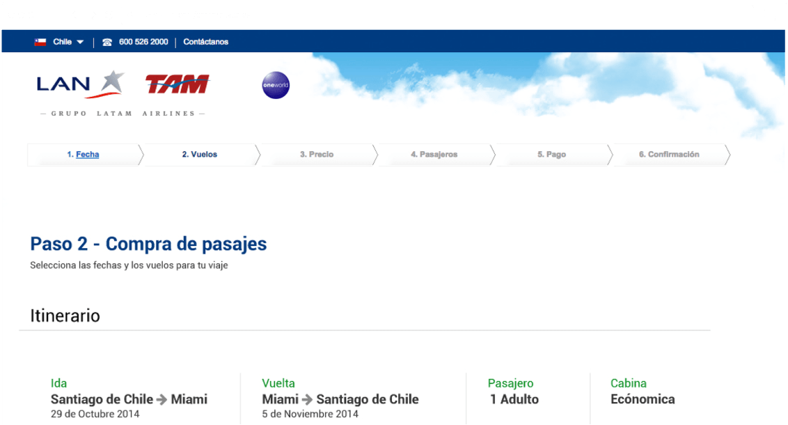
"Choose your flight"
redesign proposal
LAN Airlines is the flag carrier of Chile, and one of the largest airlines in Latin America.
LAN Airlines is the flag carrier of Chile, and one of the largest airlines in Latin America.
The project main objective was to polish the UI, solve legibility issues, and highlight most relevant information like flight number, dates, and price.
The first step was to analyze the current UX, take notes of pain points, bad practices, and propose solutions. Then a competitor analysis was run to check how other services like Skyscanner, Iberia, and KLM were approaching the flow.
Use the switch at the bottom left to toggle between the original and the final version.
Scroll down to read a detailed explanation
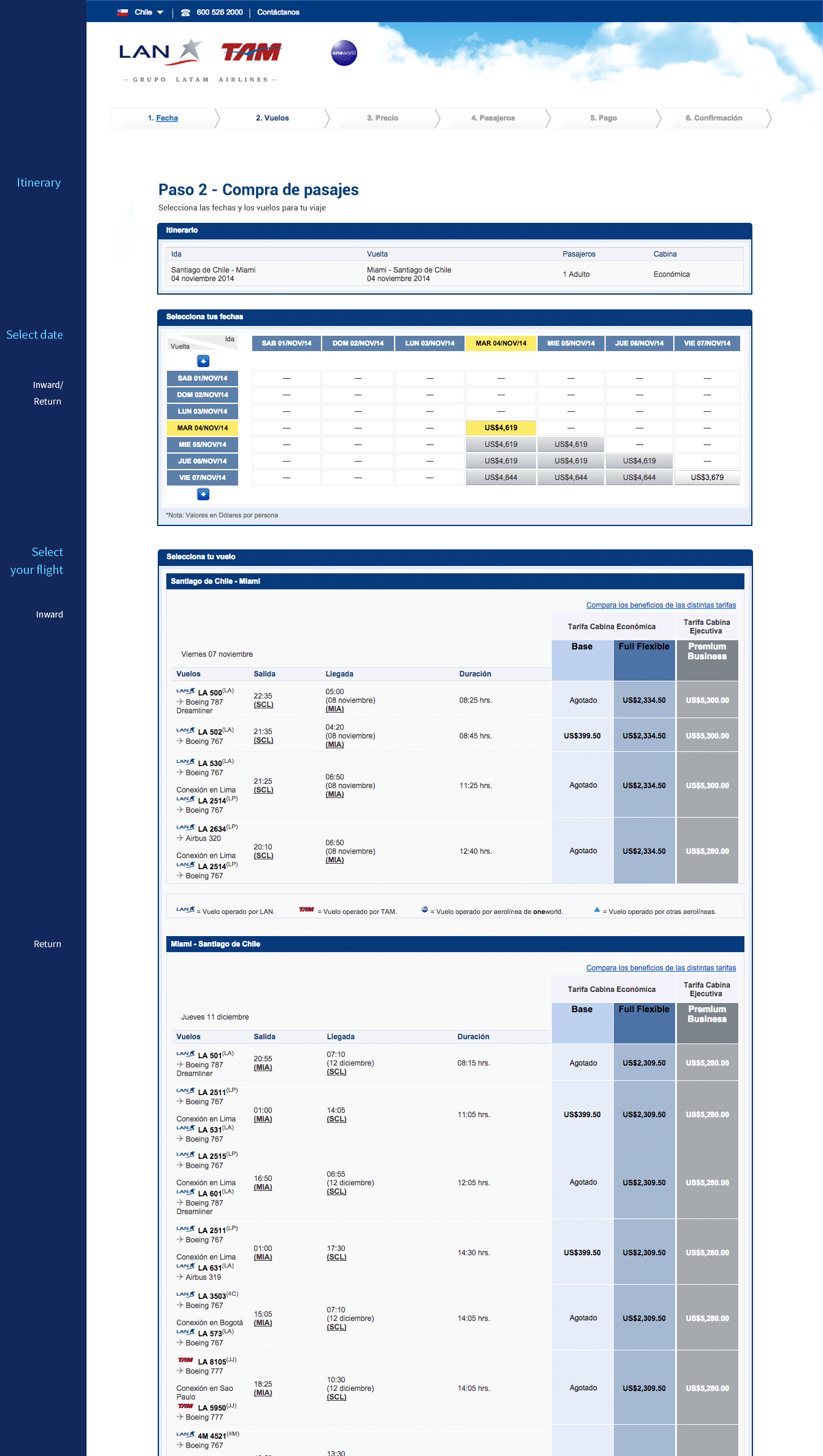
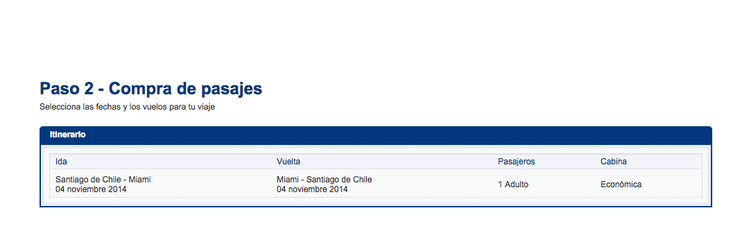
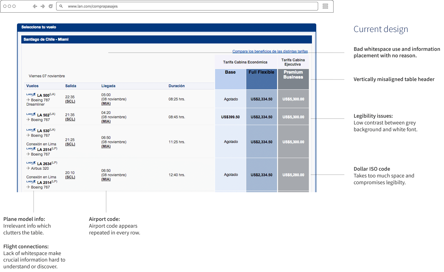
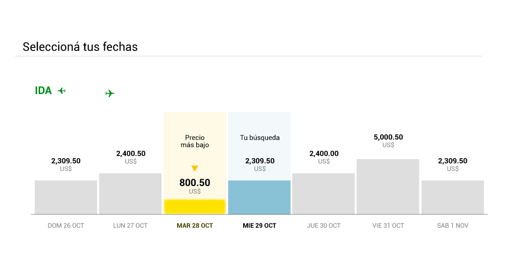
UI bloated with borders and different backgrounds.
UI elements take too much space and distracts the user sight
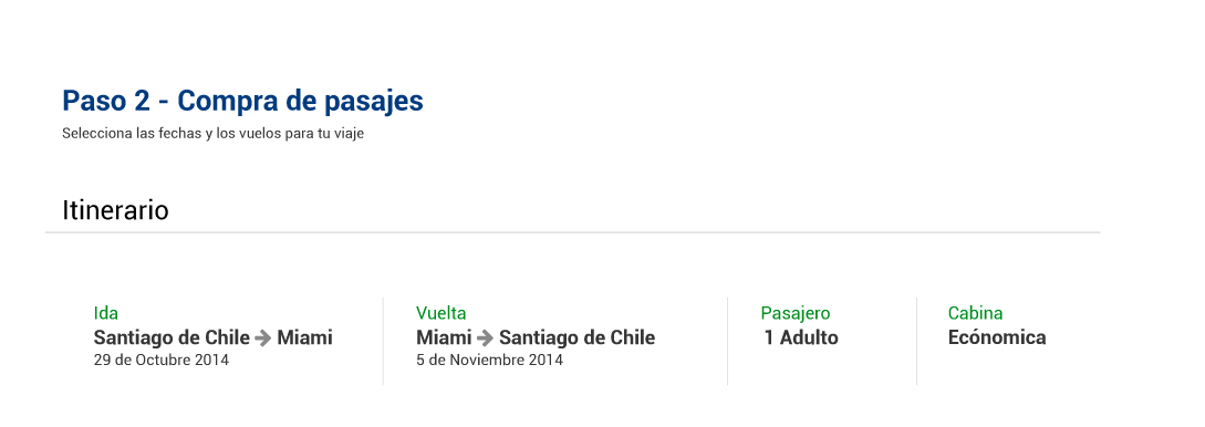
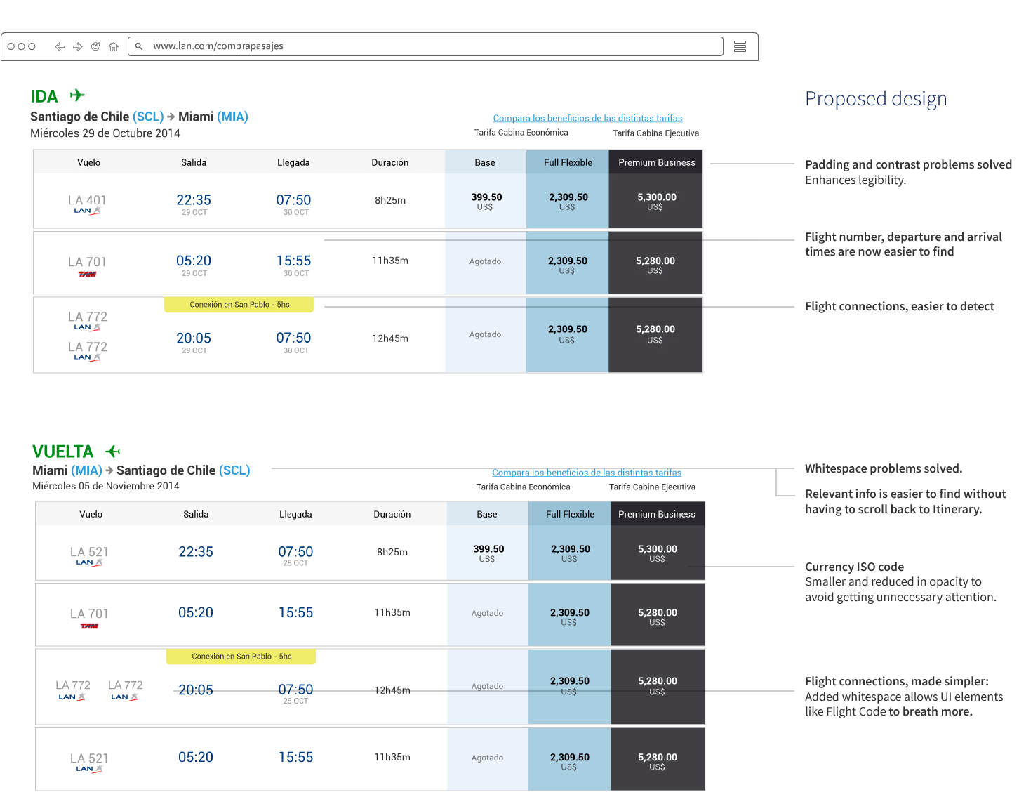
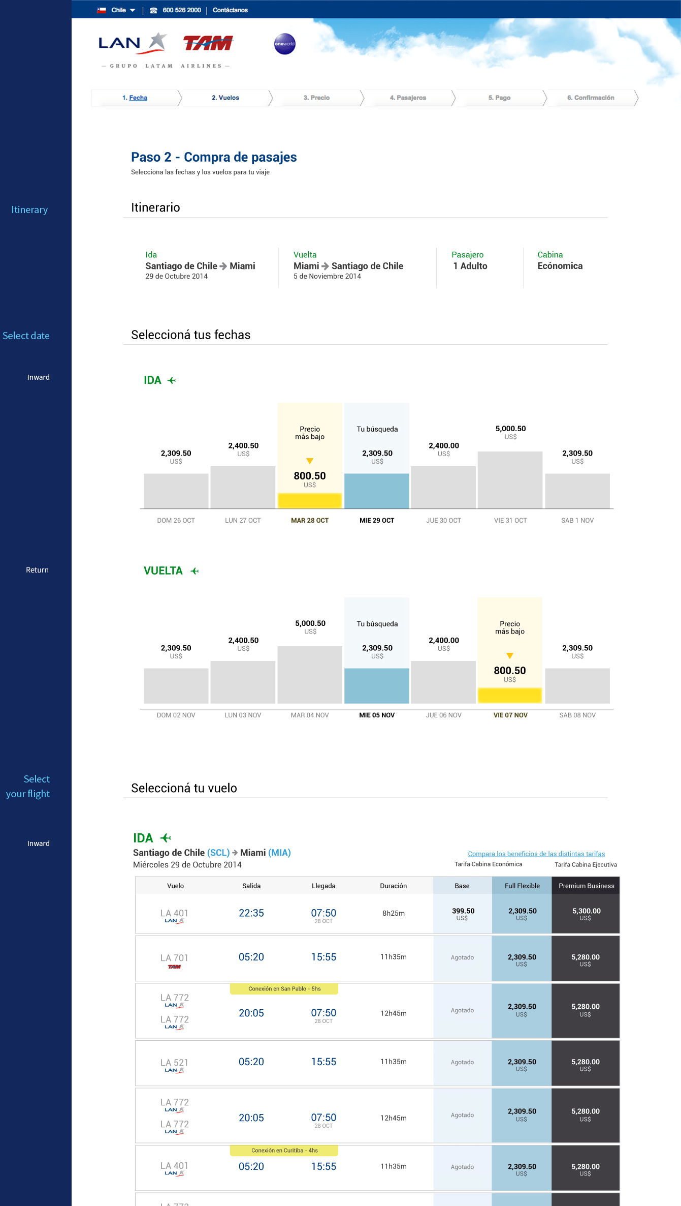
Unnecessary UI elements removed to focus in what´s matter information.
The use of colors, font sizes and weight variables ease the understanding of the info.
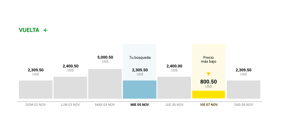
The double-entry table may be too complex to understand and use it.
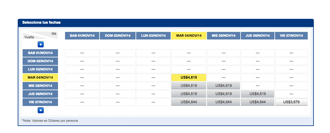
Table splitted in two sections: Outward.
Return.