Booking.com · 2018–2022

Redesigning the Availability Calendar for 1.25M+ partners

Role Product Designer
Platform Android iOS
Scope AV Pulse team
Audience 1.25M+ accommodation partners, 228 countries

Context

What is Pulse?

Pulse is Booking.com's mobile app for accommodation partners, available in 43 languages on Android and iOS. At the time of this project, it served over 1.25 million active partners who used it to manage reservations, respond to guests, and update availability and rates on the go.

For many of them, especially smaller property owners, Pulse is their main interface with the platform.

The Availability tab was widely regarded as the most complex section of the app.


Summary

Problem

Partners struggled to understand their room status. The calendar used ambiguous colored dots and a flat information architecture that made it impossible to identify which room had an issue on which date. 30% of surveyed partners cited room status comprehension as their biggest pain point.

My role

Sole designer on the AV Pulse team. I redesigned the Availability Calendar across Android and iOS, owning the project from design sprint through Beta launch — 7 months of iterative research, design decisions, and cross-team collaboration.

Impact
  • 71% partner satisfaction, up from 65% baseline.
  • 75.7% Beta retention across ~3,900 partners.
  • No negative impact on support tickets, bookings, or app stability.
  • Design direction validated at scale through A/B testing and rolled out to all segments on both platforms.

What research told us

Research showed that a cluttered UI was confusing partners, losing their time scrolling through long room lists, and unable to tell why a room was unbookable or how to fix it.

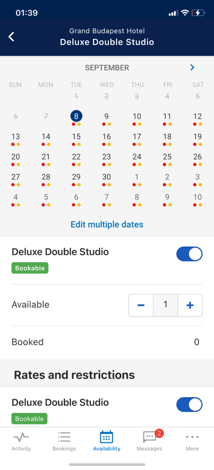
Which date does this dot belong to?
Dots sit between rows. Partners can't tell if a status refers to the date above or below.
4 colors. Partners can't decode them.
Red, yellow, blue, no dot. Too many states, no explanation.
All rooms on one page.
Every property and room type stacked in a flat list. No way to isolate issues.
Unbookable, but why?
No guidance on what action to take. Partners don't know how to fix it.
Process

Defining our approach

The redesign was shaped by continuous partner research across 7 months, followed by validation through a Beta program, partner visits, and multiple A/B experiments divided in phases.

Getting the right people in the room to define the direction

The Availability Calendar problem was complex enough that it needed alignment and feedback from people with different backgrounds. With that in mind, I organized a two-day design sprint and invited researchers, PMs, and designers from across Pulse and Extranet teams.

Day 1 focused on research sharing and problem alignment. Day 2 focused on solution drafting, feedback, and voting.

My concept proposed a hierarchy based on progressive disclosure (Property > Room overview > Calendar), with color-coded cells replacing dots and guidance messages explaining room status. It was the most voted concept and became the blueprint for all subsequent iterations.

Other directions had been proposed and drafted by teammates: a Filter-based approach and a Tab-based navigation. Unfortunately, both approaches had limitations. Filters require active input before partners can see anything useful, which contradicted the goal of surfacing room status immediately. Tabs didn't scale: a property with 15+ room types would produce an unnavigable tab bar on mobile.

Our Creative Cave in Amsterdam for 2 days
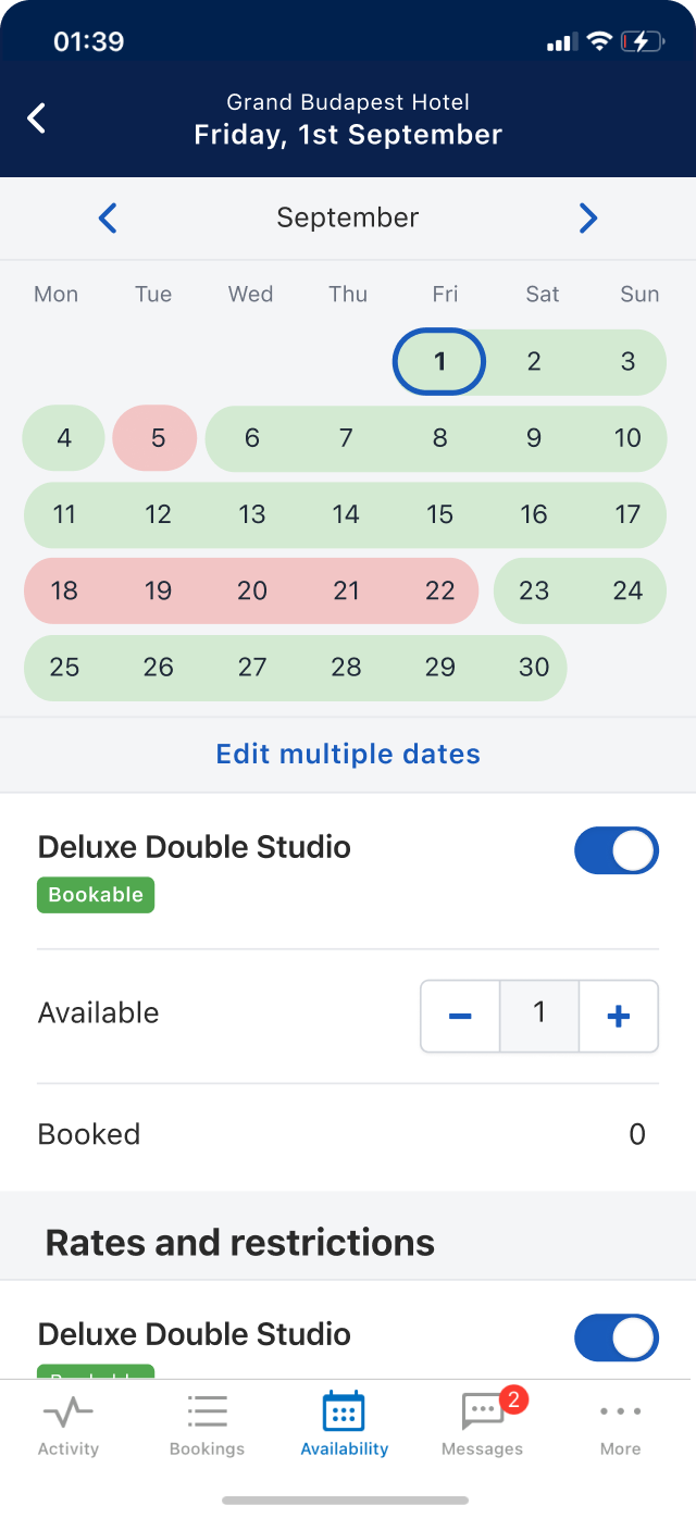
Before and after

From flat list with dots to structured hierarchy with clear status

Before
After

Adapted to partner complexity

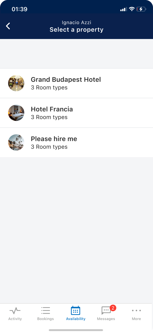
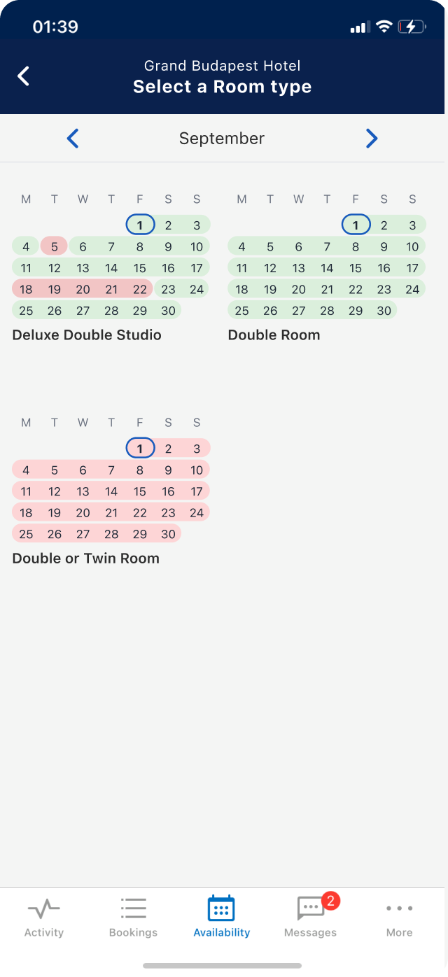
Personalising the experience for over a million partners with vastly different setups isn't straightforward. I designed a system of three screens that adapts to each segment by showing only what's relevant. One architecture, zero redundant engineering

Property Selector
Room Selector
Monthly Calendar
Multiple properties
A manager running 3 hotels. Partners need to switch between properties without making mistakes.
Multiple rooms
A boutique hotel with 5 room types. Partners need to see which room has issues at a glance.
Not needed
Still one property.
1 room type
A studio apartment. Only one room to manage — partners just need a clearer calendar.
Not needed
Only one property.
Not needed
Only one room type.

From ambiguous to obvious

A color-coded calendar replaces hard-to-read dots. Each cell makes availability status immediately clear — no interpretation needed.

11
12
1314
18
19
2021
11
12
1314
18
19
2021
Dots Full Cells
Readability

Small and hard to distinguish at a glance.

Full cell color status visible immediately.

Date Relationship

Dot floats above the date, connection is implied.

Cell is the date, relationship is direct.

Accessibility

Low contrast, fails WCAG standards.

Color + size meets accessibility requirements.

Reassurance
Ambiguous: Unclear if white or empty space means "available."
Unambiguous: Green cells confirm rooms are bookable, aligning with desktop.

Guidance when rooms aren't available

When a room can't be booked, a contextual message tells partners exactly what to do next — reducing confusion and support requests.

Room status Guidance message

Bookable

Room is open and available for guests to book.

No message needed.

Sold out

Fully booked. No availability left for this date.

"Sold out: To make this unit available, add availability"

Unbookable

Closed, no rates set, or restricted by minimum stay.

"No rates: Add at least one rate to make this room bookable"
"Restricted: Remove the minimum length of stay restriction"

Property Switcher: from recurring discussion to testable hypothesis

Designers across Pulse had repeatedly flagged the same need: multi-property partners required a way to switch context between properties without losing their place. No team had the right conditions to test it at scale.

I included the Switcher in the calendar redesign. It fit the core principle I was working from: reduce the number of decisions partners need to make per screen by surfacing one property at a time. The AV Calendar gave us a contained environment with a relevant audience and a clean rollback path.

I aligned the other Pulse designers, got PM and engineering buy-in, and shipped it as part of the redesign. It was the first time the concept had been tested with a meaningful sample. What had been a shared intuition became evidence.

Process · Validation

From Labs to partner visits, testing across 7 months

Three rounds of Design Labs and Open Labs ran between January and March 2019. Open Labs were internal sessions with Customer Service agents, who had frontline knowledge of partner pain points. By March, the core concept was stable.

In May, I created prototypes for remote usability testing. Prototypes were built in HTML/JS rather than Figma to support real interaction. A lightweight JS file acted as a shared data layer, so any change a partner made to room availability or rate prices would instantly reflect across all screens, keeping the experience consistent end to end.

Working with our UX Researcher, I defined the research questions, interviewed partners directly, and co-facilitated six sessions. Partners preferred colored cells over dots, understood the hierarchy, and valued the guidance messages.

In October, eight partners were visited in Amsterdam. One key tension surfaced: partners couldn't distinguish "fully booked" from "closed." This led to reintroducing a third color (yellow for "sold out") alongside green and red.

Experimentation

Phased rollout by partner segment

The rollout was sequenced by complexity, not speed — each phase targeting a more operationally demanding partner segment than the last. This was a deliberate risk management choice: by the time the full flow change reached the most complex setups, the concept had already proven stable in simpler environments.

Before committing to a full A/B test, a Beta program gave the highest-complexity segment a low-pressure entry point — opt-in, with continuous feedback and the freedom to leave at any time. The retention rate from that Beta became the qualitative signal that justified scaling to a full experiment across both platforms.

Phase 1
1 room type
Calendar UI changes only. Colored cells, guidance messages. No navigation change.
Rolled out to all
Phase 2
Multiple rooms
Full flow change. Room Selector with Calendar Overview + all UI improvements.
Rolled out to all
Phase 3
Multiple properties
Beta program. Partners opt in, give continuous feedback, can leave anytime.
75.7% retention
Phase 4
A/B test in both platforms → Rolled out to all.
Both platforms. All segments. Design direction validated at scale.
71% satisfaction

What the experiments proved

The design direction carried through to full A/B experiments on both platforms. Satisfaction reached 71.11%, exceeding the 65% baseline. There was no impact on support tickets, bookings, or app stability.

Partner satisfaction · A/B
71.1%
Up from 65% baseline. Exceeds target across ~5 months of measurement.
MUP satisfaction · Beta
76%
Up from 66.6% baseline. Strongest improvement across segments.
MPP satisfaction · Beta
63%
Up from 58.8% baseline.
Beta retention for all partners
75.7%
2,952 of 3,888 partners stayed in the program.
Bulk edit usage · iOS
+10%
More partners opening bulk editor and selecting multiple dates.
Guidance message
+3%
More partners acting on rooms with a guidance message.
CS ticket impact
None
No increase in availability-related support calls.
Booking impact
None
No decrease in net booked room nights.

Reflections

What I would have done differently

Introduced the third color earlier.

Every research session surfaced confusion between "fully booked" and "closed." We could have saved a cycle by testing three colors from the start.

Tested Room Selector scalability earlier.

Partners with 10+ room types flagged clutter concerns in June 2019. We didn't address it before Beta. Pagination or grouping would have mitigated this.