Booking.com · 2022–2023

Designing a scalable room customisation system

Role Product Designer
Platform Android · iOS
Scope Room Selection Apps
Scale Hundreds of thousands of daily sessions

Summary

Problem

Guests had no structured way to express their room preferences — non-guaranteed customisations like bed type, floor, or smoking preference they can request at booking. Partners had no structured way to honour them. Unmet requests were causing cancellations and review score degradation.

My role

Sole designer on Room Selection Apps. I led the full design process from initial awareness experiments through to a multi-step customisation system — owning all design decisions, cross-team collaboration, and experiment strategy.

Impact

Proved via block-out test: removing the customiser cost ~500 bookings per night, confirming its value.
+50% cot and extra bed requests after cross-team integration.

Discovery

What we knew going in.

What was working

Guests

Felt more in control by setting expectations upfront, boosting trust and satisfaction.

Partners

1.3 review score uplift for partners who honoured requests — worth ~900€ per year in commission.

What wasn't working

Guests hit a dead end

Preferences were only discoverable at the final booking step, via a free-text field — especially frustrating on mobile.

No scale for partners

234K unstructured free-text requests per day, with no way to process common ones at scale.

My hypothesis

By letting users select preferences during Room Selection, I aimed to replace 234K daily free-text requests with structured, actionable data — without hurting conversion.

Process · Chapter 01

Foundation

Before designing a dedicated screen, I needed to understand how much the room card could hold — and what happened when I pushed past its limits.

Period 2022
Platform Android · iOS
Focus Awareness · Inline selection · IA

Process · Foundation

Four experiments that set the way.

Before designing a customisation flow, I needed to establish whether users would engage with preferences at all inside the room selection context.

Rather than building a full solution immediately, I structured a sequence of experiments that progressively increased intervention complexity — each one informing the next.

01
Base

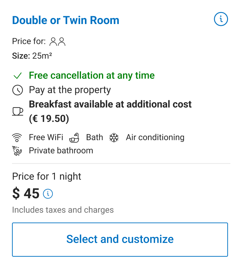
The initial card design made no mention of the possibility of customising the bed type, a key gap in communicating available options to the user.
Awareness only
02
Awareness only

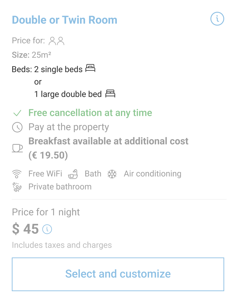
The smallest testable hypothesis: not whether users would customise, but whether they noticed that options existed. I surfaced bed type options as static information on the room card — no selection mechanic. This isolated the impact of awareness alone.

Design challenge: bed configurations varied significantly. Presenting all options in a single line became unreadable for edge cases. I proposed displaying each option on its own line to preserve clarity across all configurations.
Awareness only
03
Inline selection on the room card

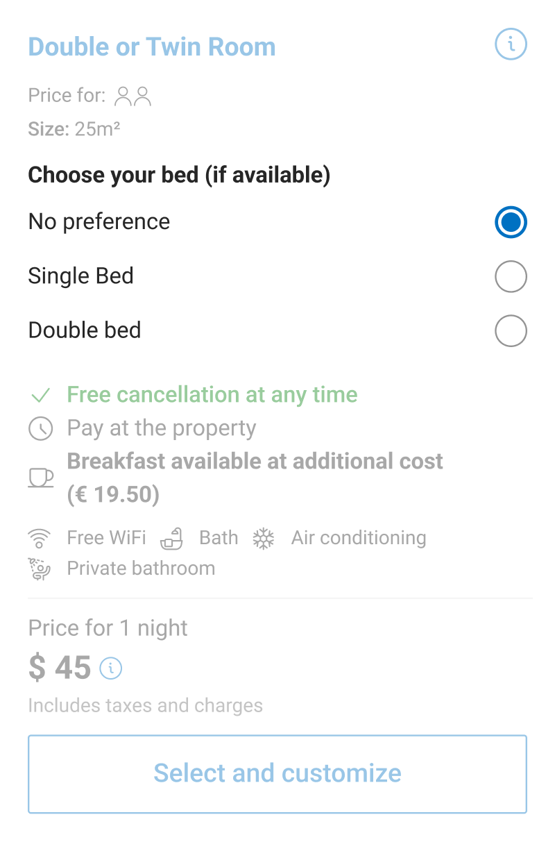
Building on positive awareness signals, I brought preference selection directly into the room card. Focus: bed type — the most requested room-level preference, already an established pattern on Desktop. This tested whether users would engage when given immediate, inline control.

+4,282 bookings with bed preference
Inline selection on the room card
04
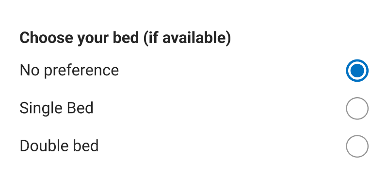
Establishing the default state

A key team discussion: what should the default selection be? I decided to make "No preference" the explicit default. Auto-selecting a bed type for every eligible room would have generated unintentional requests at scale, driving up partner workload and pushing down reply rates — directly undermining the review score improvement the feature was designed to produce.

Trade-off: lower apparent engagement to protect partner experience
Establishing the default state
05
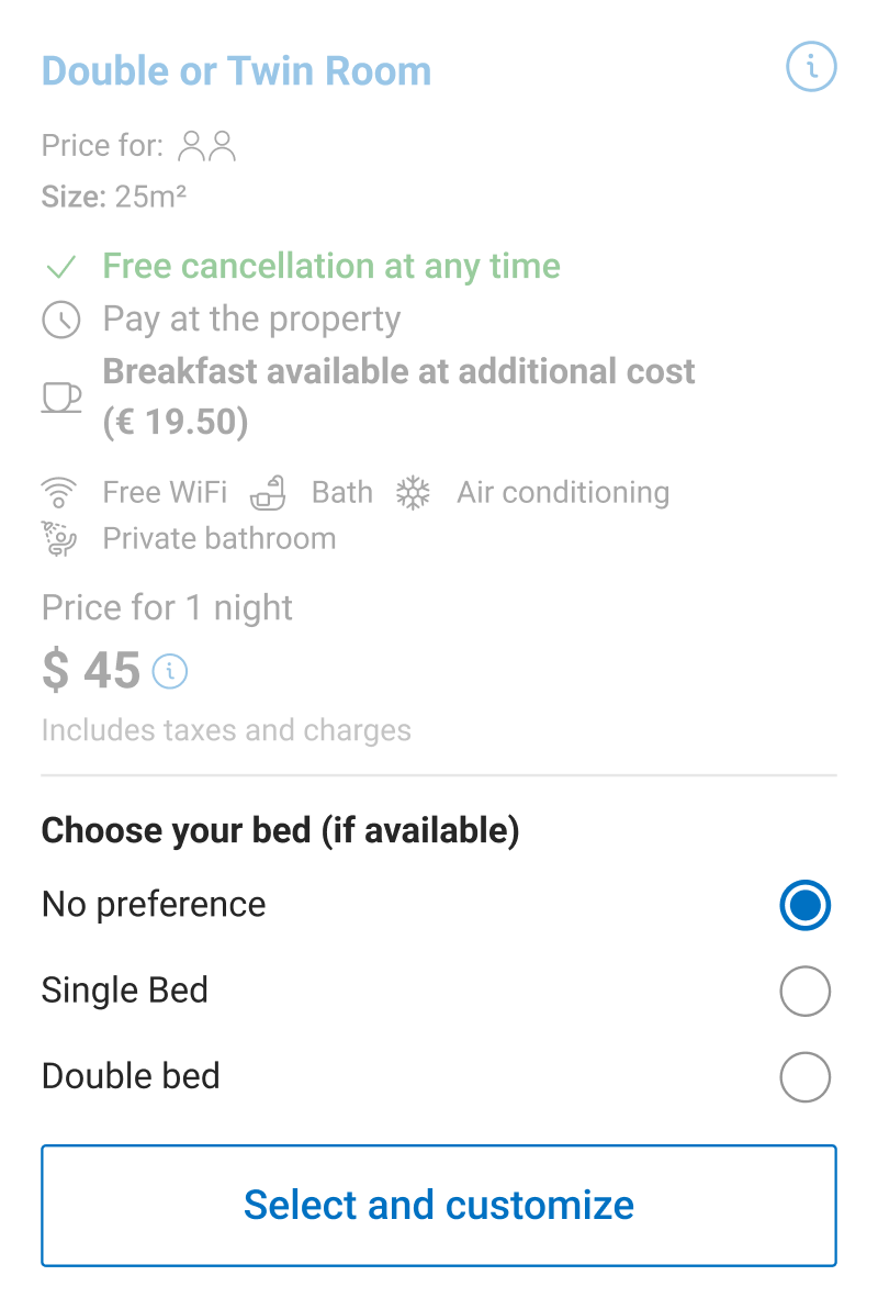
Information architecture restructuring

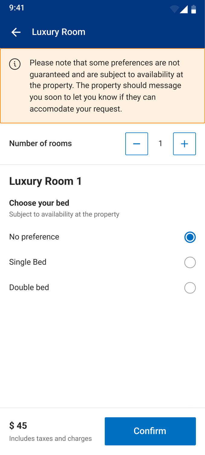
As the room card began carrying more interactive elements, I restructured its IA: Static information (details, conditions, pricing) moved to the top. Interactive elements (preference selection, number of rooms, room CTA) moved to the bottom. Clear separation between reading and deciding.

+47 bookings · Structural foundation established
Information architecture restructuring

As experiments showed positive signals, I began exploring designs that could support multiple preferences simultaneously.

The limits of the Room Card

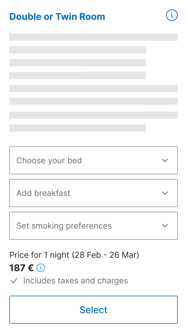
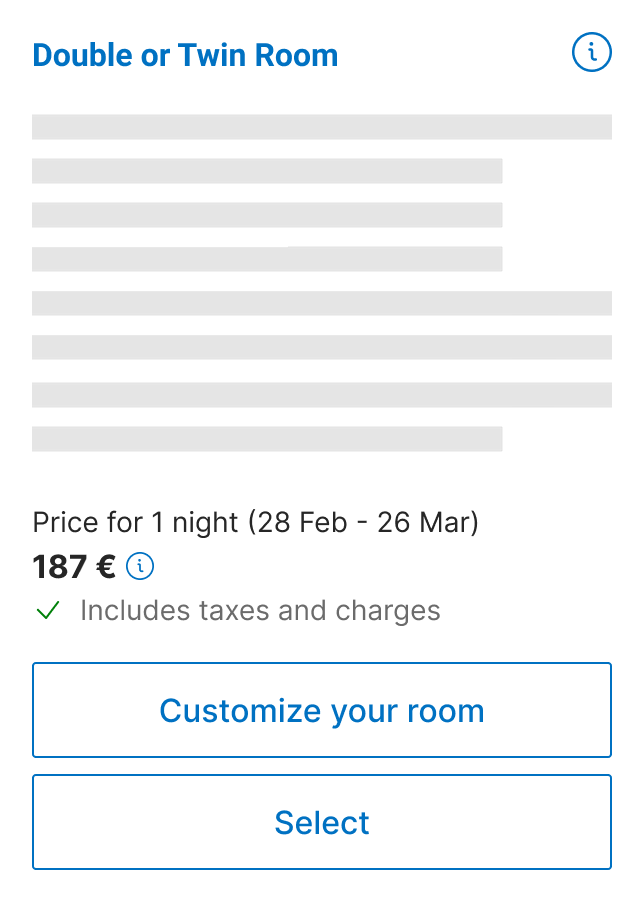
Even two preferences would significantly increase card height, hurting scannability and comparison. Past A/B tests confirmed this — small height increases consistently hurt conversion — so this direction was discarded early.

Base room card
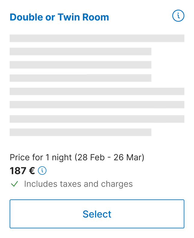
Adding two preferences easily doubled the room card height.
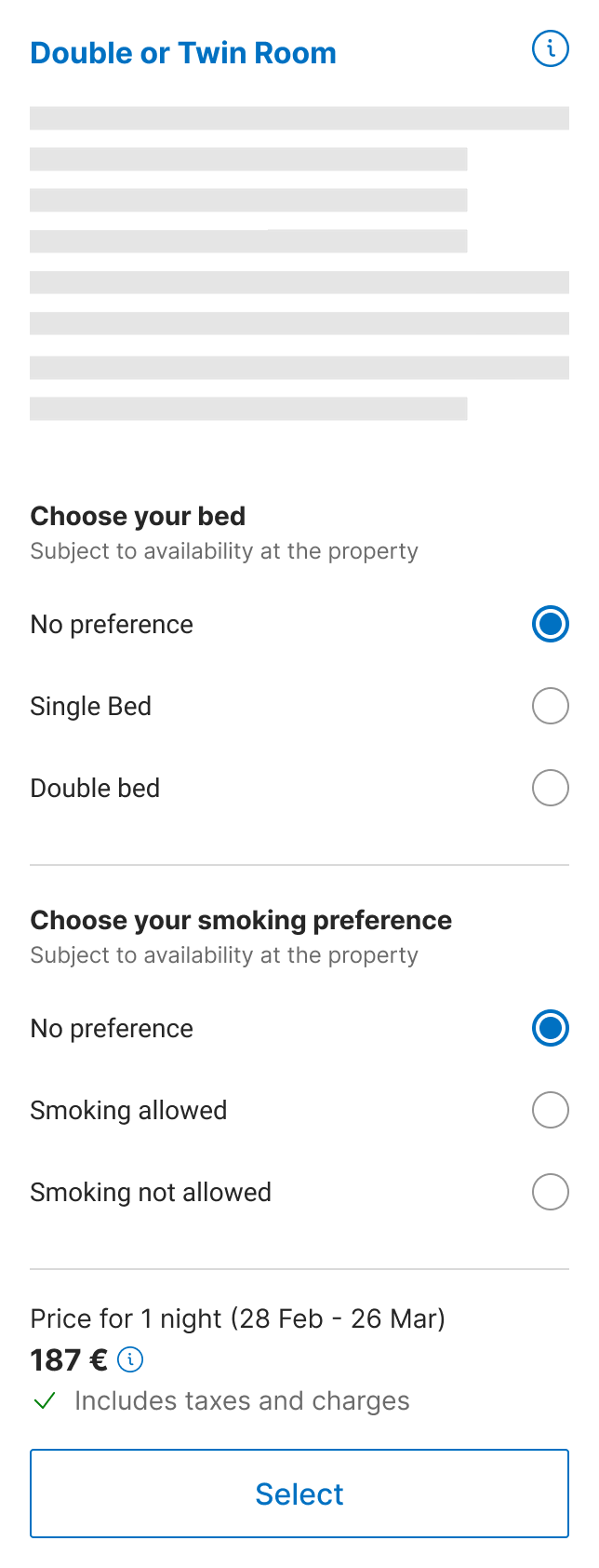
Dropdown helped to keep the height short but required multiple taps to select options.
Chip-based multi-select at the bottom of the card.
Conclusion

A dedicated screen was necessary. One that could scale the preference experience without compromising the room selection flow.

Process · Chapter 02

Proving the concept

With a dedicated screen established as the right direction, the next question was the container. Two variants, one clear tension: protecting conversion against maximising customisation rate.

Period 2022
Platform Android · iOS
Focus Container · Collaboration · Validation

Arc 1 · 2022 · Proving the Concept

Two variants. Two competing risks.

The first big experiment tested a clear tension: protecting conversion versus maximising customisation rate. Both variants were built to accommodate multiple preferences simultaneously — future-proofed for a roadmap that had not yet arrived. Both cost bookings against the preferred option, but neither hurt conversion — the two designs failed differently, not equally.

Bottom Sheet

A lightweight overlay keeping users anchored in the room list. Minimised perceived commitment to protect conversion.

−15% preference-matched bookings

Full Screen

A dedicated screen for all room customisation, using dropdowns to manage height across multiple rooms and preferences.

−12% preference-matched bookings

Diagnosis

Both designs hurt the metric they were built to improve. The root cause: we had over-engineered for a future state that hadn't arrived yet.

Decision

Back to basics.

Both containers had been built to hold multiple preferences, future-proofed for a roadmap that wasn't arriving on schedule. The structural complexity was creating friction for what was, at that moment, a single-choice task.

I took the single-screen structure of Variant 2 and replaced the complex input components with radio buttons — the simplest possible interaction for selecting one option. No dropdown overhead. No container designed for a future that wasn't here yet.

+5% preference-matched bookings

This iteration went full-on.

To prove business value, we removed the feature entirely.

With the customiser at full-on on Android, the PM ran a block-out experiment — removing it entirely and reverting users to the free-text field — to confirm the incremental bookings were genuinely caused by the feature, not by seasonal trends.

The result was unambiguous. Removing the feature cost approximately 500 bookings per night on Android alone. It gave leadership a concrete data point to justify resourcing a more ambitious multi-step structure in 2023 — the conversation started from evidence, not assumptions.

Finding the right structure

The single-screen customiser was commercially proven. The question shifted from whether to build a dedicated flow, to how that flow should work across multiple rooms and preferences.

Period 2023
Platform Android · iOS
Focus Multi-step · Container · Microfunnel

The question shifted from what to how.

With the single-screen customiser proven commercially, the question shifted to flow structure. I evaluated alternatives and narrowed to three, before pushing back on the PM's plan to improve single-screen first — optimising a foundation we already knew would be replaced gave no useful signal.

A
The current experience

Show every available customisation option on a single screen

Discarded · Customisation flow complexity
B
The Linear Flow

Sequential screens per customisation, inspired by e-commerce product detail patterns. Ruled out: the room detail page was already dense.

Discarded · Room page complexity
C
The Multi-Step Customiser

Each customisation in its own dedicated screen, inspired by airline booking flows. Tested in its raw state to get a clean read on whether the structural approach itself was valid — not an optimised version of a design we'd replace.

Full-on · Validated the multi-step customisation hypothesis
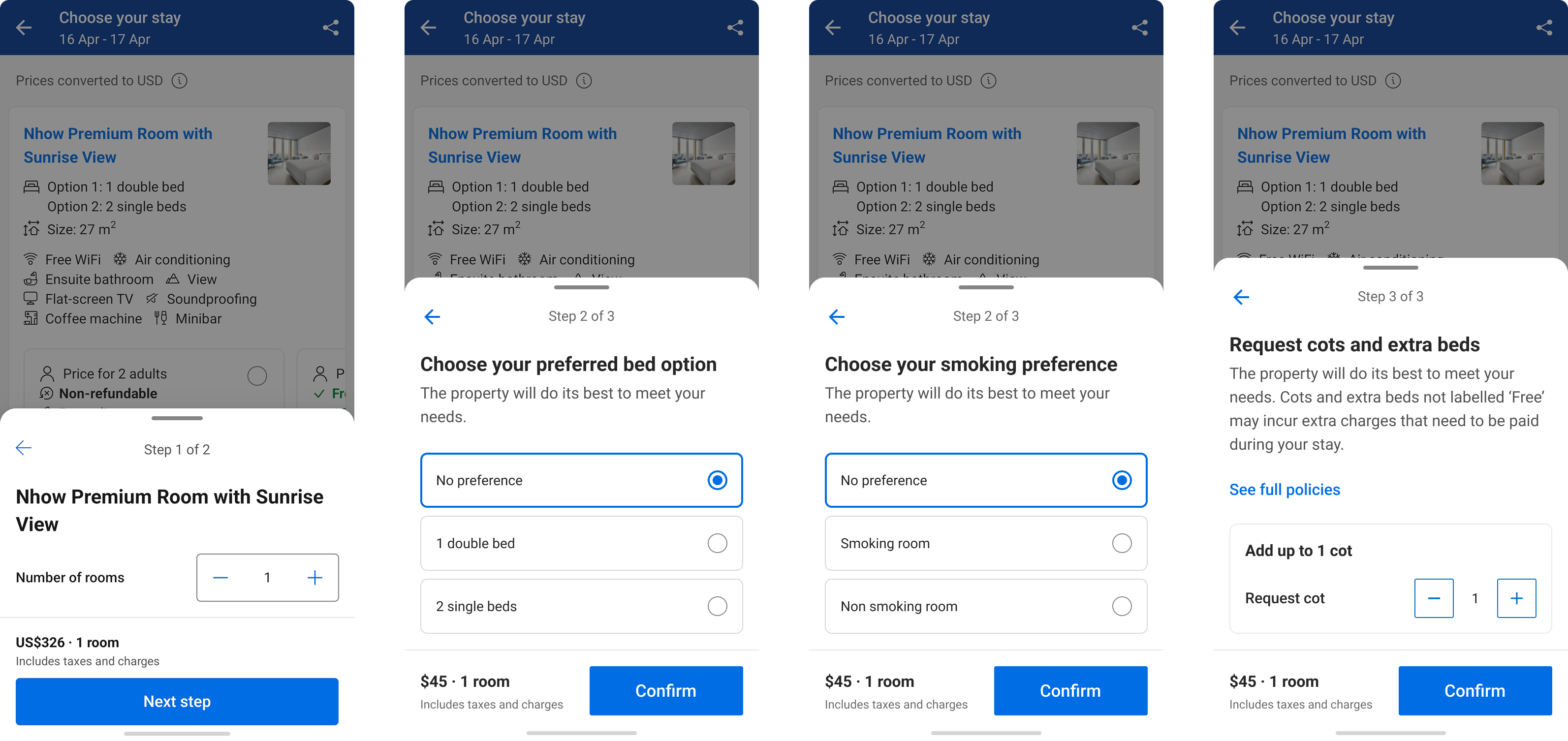
Multi-step customiser prototype

Container experiment

48% of users were leaving by tapping outside.

The first multi-step experiment used a bottom sheet as the container. During review, I noticed 48% of users were exiting by tapping outside — a default bottom sheet behaviour with no confirmation gate. I worked with the Lead Designer on alternatives and shared a written pros/cons document to move the conversation from opinion to evidence.

The bottom sheet won — it increased customisations the most while remaining non-inferior on conversion.

Impact

What the experiments proved.

Block-out experiment · Android +500 BPDs

Bookings per night increase since the customiser was added.

Cots and extra beds +50%

Requests for cots and beds on first run. No conversion drop.

Multi-step experiment Full-on

Validated the value of the multi-step customization hypothesis.

Reflection

What I'd do differently.

Don't design containers for roadmap assumptions without validating the delivery timeline.

The first experiment failed because I built for multiple preferences before confirming when they were technically arriving. Earlier pushback on that dependency would have saved an experiment cycle.

User testing and quantitative experiments answer different questions.

Early user testing indicated a preference for the bottom sheet. The experiment showed the opposite: full screen cost fewer preference-bookings (−12% vs. −15%), with no conversion penalty either way. Small sample qualitative research tells you about comprehension and comfort — it cannot predict behaviour at scale. Both signal types are necessary; neither is sufficient alone.

The confirmation dialog was never tested.

We shipped a working solution but left an open question: was the 48% bottom sheet abandonment intentional or accidental? Understanding the mechanism, not just the outcome, would have informed future iterations more precisely.